A brand identity book for an imaginary museum: the Kite Museum.
BRIEF.
Ideate and developed all elements and aspects needed for the corporate identity and communication of the museum: logo, internal & external communication materials, and merchandise.
_______________________________________________
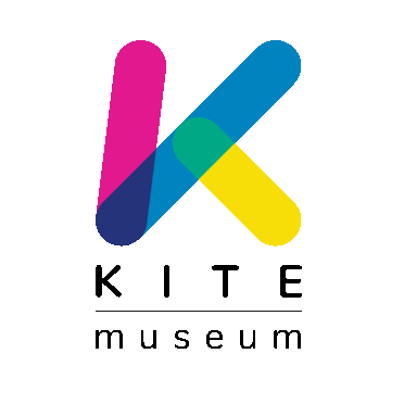
LOGO DESIGN.
Initial sketches on paper.


Geometrical construction of main logo element based on a grid of squared units.


Complete structure of the logo, including logotype & respect area.


Final design & development of "family feeling".


COLOURS.
It's inevitable: if you think kite you think colours.
The primary colours, cyan, magenta, and yellow, are the main brand colours.

The colours, blue, red, and green, are the secondary brand colours.
Thy are born by the overlay of primary colours pairs:
cyan + magenta = blue | cyan + yellow = green | magenta + yellow = red
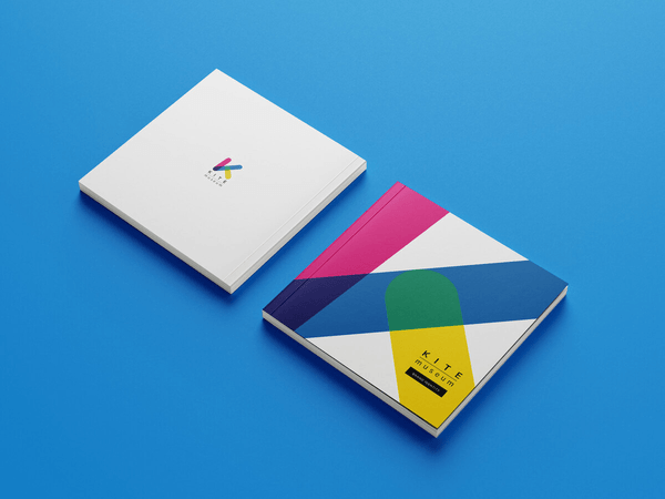
BRANDBOOK.


COMMUNICATION.


THE MUSEUM.


THE MERCHANDISE.


Project realised for my master degree at "Scuola Internazionale di Grafica - Venezia"


